Faros AI Franklin Release: Superior Data Exploration and Visualization
Faros AI announces enhancements for engineering data exploration and building custom engineering productivity charts and dashboards

Building on Faros AI for data-informed engineering decisions
Our Franklin release is packed with features that simplify every step of building on Faros AI, helping you transform engineering data into insights tailored to your mission, operating model, and culture.
As our customer Vimeo recently shared, “We started using Faros AI specifically for DORA metrics but discovered quickly that it could easily adapt with our evolving metrics, like security metrics and quarterly delivery rates. We were able to quickly build the reports and dashboards that gave us exactly what we were looking for.”
In addition to new query and visualization features, we’re introducing new connectors, a hardened CLI, faster syncs, and improved archive management.
As always, this release is named after a transformational scientist. Rosalind Franklin (1920–1958) was a British chemist and X-ray crystallographer whose groundbreaking work was crucial to understanding the molecular structures of DNA, RNA, viruses, coal, and graphite.
Franklin discovered the DNA double helix by capturing Photo 51, an X-ray diffraction image that revealed DNA's helical structure. The iconic double helix image is a testament to the power of visualization.
Let’s dive in.
Powerful query capabilities
Faros AI has extended its querying capabilities to allow you to analyze your data even more effectively.
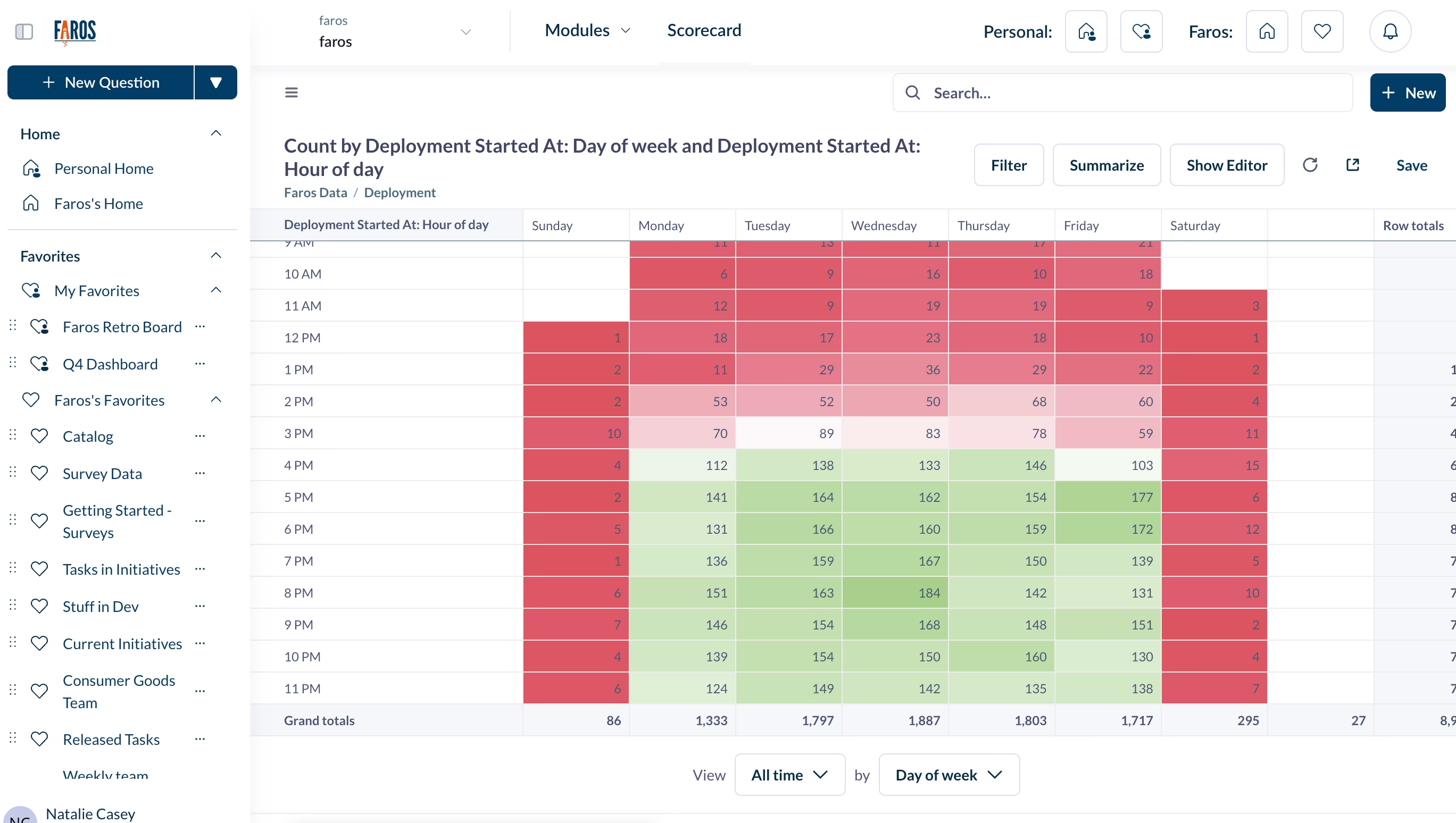
Multiple time breakouts
The Franklin release introduces the ability to incorporate multiple time breakouts within a single column of your query results. This enhancement makes it easier to create tables that display, for example, the number of bugs created on both a daily and weekly basis or quarterly metrics further broken down by month.
Using multiple time breakouts can add additional insight to your data. For example, in the visualization below, we've created a heatmap for the “busiest” deployment hours of the day.
Offset expressions, just like in Excel
Query Builder now supports offsets in custom expressions, allowing you to calculate the change from a previous period. This is handy for spotting trends and better understanding how your data behaves over time.

Reuse predefined calculated metrics
Want to standardize on one way to calculate a metric like Change Failure Rate (CFR) or Say/Do Ratio? Now, you can save a metric (under Dashboard Directory) to make it available when anyone builds a query. Predefined calculated metrics can help improve consistency across charts and shorten the time to build a new query.
Boolean expressions in custom columns
Custom expressions now support boolean returns, eliminating any hacks to cast into strings or numbers.

New charts and visualizations
Along with these new querying capabilities are new visualizations to enhance your dashboards.
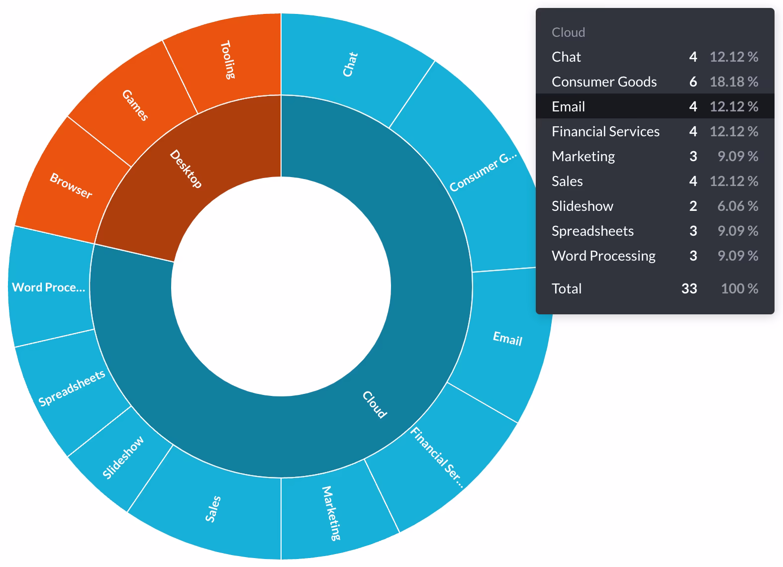
Introducing sunburst charts
This brand-new visualization option is a multi-dimensional pie chart that can include up to three breakout levels visualized as rings. Sunburst charts excel at depicting nested or hierarchical structures.
More trend comparisons!
Trend charts give you a snapshot of how KPIs are tracking against a previous time period or target number. Now, you have more options for configuring those time ranges and benchmarks, and you can display up to three comparisons on one chart. Adjust and compare against a unit of time, the time increment, a static number like a goal, or another column like an average.
Combo stacked bar charts
Who doesn’t love a stacked bar chart? You can now combine them with a trend line in a combo stacked bar chart.
Easy dashboard customization
Faros AI users love to create custom dashboards to support their daily work and recurring cadences. These new features make them work even better!
Get started faster with section templates
There’s nothing harder than starting from a blank page, so now you can leverage sections! Sections are templates with headings and pre-arranged layouts for charts and KPIs.
Add iframe cards
Embed iframes into your dashboards to display related information like videos, docs, and widgets. Embed anything that completes the context so your dashboard can truly be the one-stop-shop you envisioned.

Change the time grouping
Add a time grouping widget to any custom dashboard to easily switch between daily, weekly, monthly, quarterly, and annual views. The selected time grouping will instantly apply to all the charts in the dashboard.
Giant monitor comptibility
Giant screens have been known to warp even the best-designed dashboards. Now, you can limit the width of your dashboard so it will still look good on those huge monitors.
Replace a card with a click
Love your dashboard but want to switch out a card? In Edit mode, simply hover over the card and click the “Replace” icon. The dashboard will automatically update and display the new card to look great in any size you choose.
Export pivot tables to Excel
Pivot tables generated in Faros AI will keep all their pivoty goodness when exported in a download or dashboard subscription, so you can continue working on the table in Excel. By default, all exported data keeps the formatting you set in Faros AI (e.g., if you formatted 187.50 as $187.50), but you can opt to download without formatting if preferred.
Archived content
If you happen to see something that’s been trashed, there’ll be a clear indication with a banner, and you’ll have the option to restore or delete it permanently. Also, trash is now a collection—meaning you can search, filter, sort, and view metadata. It’s visible to everyone, but permissions will determine which trashed items people can see.
Platform enhancements
The Franklin release brings significant performance improvements with faster data sync for key models, a more robust Faros Events CLI, and expanded integrations with new connectors.
Faster data sync for the most important models
The Franklin release breaks up the reports database sync into individual table syncs. Important tables such as employees and teams can now be updated at a much faster cadence than before, as their updates are no longer blocked by the processing of more complicated tables.
A hardened Faros Events CLI
The new and improved Faros Events CLI, which ingests data from the source and pushes it to Faros AI, is now available. The new CLI is less error-prone, easier to incorporate into your workflows, and has improved support for Windows operating systems.
New connectors
In this release, we’ve added support for Tromzo, Vanta, Zephyr, and Wolken and improved our Azure DevOps connectors.
To learn more about these capabilities or speak to a product expert, reach out to our team.

Naomi Lurie
Naomi Lurie is Head of Product Marketing at Faros. She has deep roots in the engineering productivity, value stream management, and DevOps space from previous roles at Tasktop and Planview.
Read the report to uncover what’s holding teams back—and how to fix it fast.
What to measure and why it matters.
And the 5 critical practices that turn data into impact.


- Engineering throughput is up
- Bugs, incidents, and rework are rising faster
- Two years of data from 22,000 developers across 4,000 teams
Tokenmaxxing: Why AI token consumption isn't engineering productivity
Tokenmaxxing—treating AI token consumption as a productivity metric—is repeating the lines-of-code mistake. Data from 22,000 developers points to a better way to measure AI engineering impact.